
Helios
ROLE
Product Design Lead & Product Designer
TEAM
Designers: Grace Ma(me), Yifei Ren, Emma Tsai
DURATION
January 2019 to August 2019 (8 months)
Brief
Helios is a platform that builds a community to turn passion into value, impact, and productivity.
Helios is a platform that connects entrepreneurial students and individuals together to build side projects and startup businesses. Its aim is to aggregate talented and passionate people to create a network where everyone shares the same drive to improve their skills and gain experience.
My Contribution
As the product design lead, I helped to navigate the project through the design thinking process and mentored the designers on the team. I also contributed as a product designer and I helped to write the script for user interviews, conduct them, wireframe, and develop the design system.
Problem
A lack of system for finding side projects means that to do so is time-consuming and there is little return for invested time.
When students and individuals want to work on side projects together, there isn't a go-to method of finding people to work with, or available side projects to join when they don't have an idea themselves. They have to reach out to their network and friends which takes time, and not everyone may commit the same amount of time to a project.
“There’s no uniform platform to show what opportunities there are.”
—Nick, Masters Student
“I’ve gone to a lot of networking events to see if people are working on anything, but it never works”
—Galen, Student and Startup Founder
Goal
Create a community and efficient platform to help realize users' entrepreneurial goals and create value.
Target Users


Research
To better understand how our users currently navigate starting side projects and the associated pain points, I conducted user interviews with the help of 2 designers with 4 participants, ranging from students driven to learn to startup owners whose companies began as side projects.
Insights & Takeaways
●
Finding people to work on side projects with is time consuming, and often done in person (clubs, events, networking opportunities)
●
The right fit relied on a person's commitment to the project and appropriate skill set
●
Those who couldn't commit an appropriate amount of time led to drop-offs
●
Social impact and opportunity to learn is important to users when they want to find a project to join
Designing the Product
Product Requirements
Taking into account the tasks that the users need to perform, we identified key features that we needed to build.
1.
A way for users to browse and join open side projects
2.
A way for users to post their open side projects to recruit new teammates
3.
A way for users to find team members for their side projects
4.
A means of connecting these two parties
Finding a Project—Browse
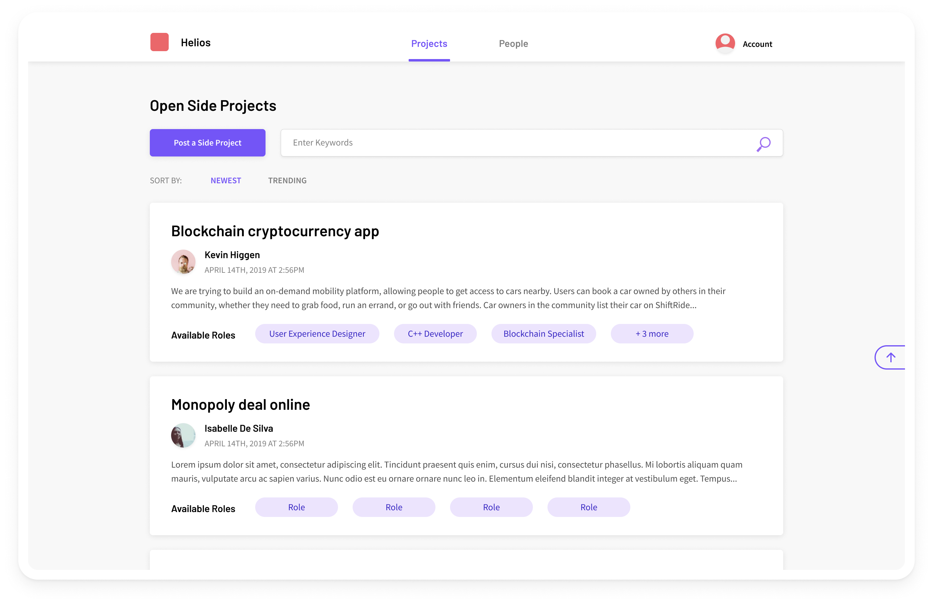
The projects page of this platform contains a list of open side projects that are seeking more collaborators.
Decision 1
A simple and focused experience that directly addresses our users' goals

This page was intentionally designed to have a little interaction as possible, keeping the experience of finding a project distraction-free. The main goal of the page is to allow users looking for a project to join the ability to browse openings. The CTA to post a button provides a quick and direct access for users that have a project but are on the recruiting end.
Decision 2
Card components provide an allowance to preview information to give users context before clicking to see more

In our research, users looked at various factors before considering working on a side project. In order to help users make a decision about which projects they'd be interested in before needing to click for additional information, I suggested using card components that would preview some information to give users more context. We considered using the pattern of a more browsable list as well, but we decided against it, as lists were more suited for quick browsing. For the experience of our website, we wanted our users to be able to make informed decisions about these side projects.
Past Iterations
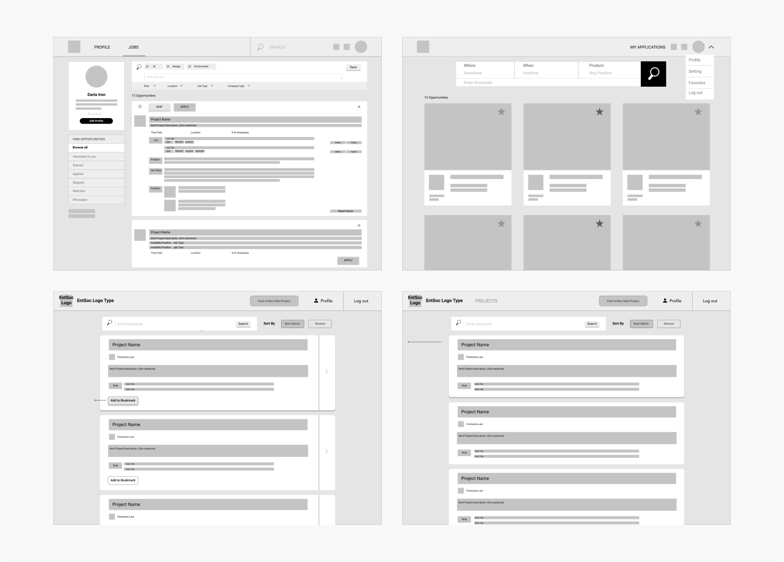
Some of our previous iterations were inspired by job board experiences. Though it contained a lot of useful features like filters and bookmarking, we went for a simpler experience because our users were likely not spending much time on this platform other than for connecting with other driven individuals. So on newer iterations on the right, the wireframes were further simplified and we put some thought into the interactions and the surfaced data.
Finding a Project—Details
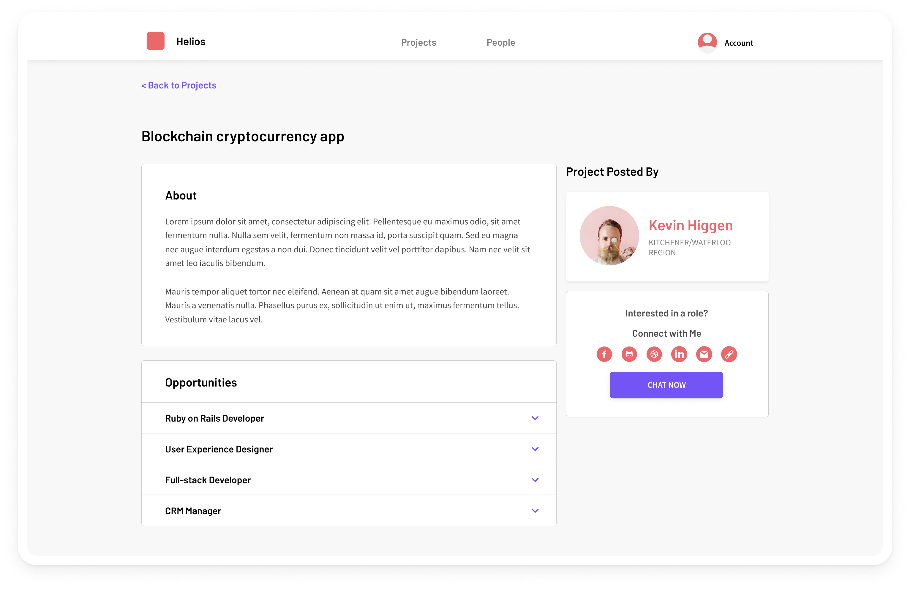
Once a user clicks into a project, they're brought to a detail page that lists out a description and the roles that the poster is looking to fill.
Decision 1
Sticky profile and contact section to give users a direct CTA
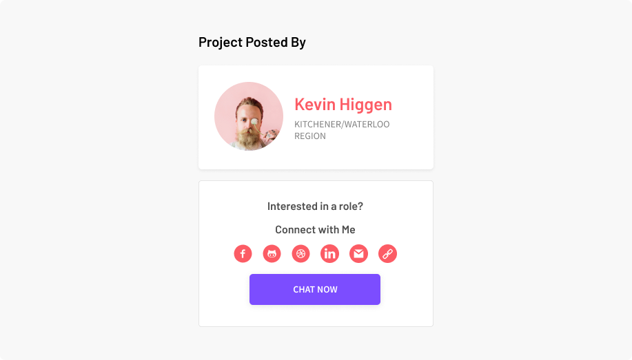
This sidebar section is a sticky component, that anchors to the top of the page as a user scrolls down. The main goal of the browse project flow is to make a connection between the viewer and the poster so that they can work together on the project. As such, I suggested to have the main function of this page available to the user at all times, therefore decreasing the friction for a user to meet their goals.
Decision 2
Chat option
Keeping in mind the purpose of this product to build community around side projects, we wanted to stay away from a job application kind of experience. In order to accomplish this, we added a chat feature to mimic casual networking or the situation of asking your friends online to participate in a fun side project.
Past Iterations
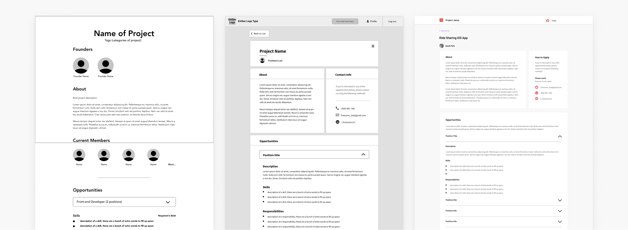
The previous version of this page were inspired by job boards and similar platforms, with the knowledge that people are typically seeking certain skills to aid with their projects. On the very right, we also tried a people-focused project details page that gave the user more information about the team.
Limitations
●
Adding team member information would be a time-consuming process; the creator of the project would have to upload name and photos. This information was not always relevant or valuable to share, so it would be wasted effort.
●
Our previous available methods of communication were through email and phone, which felt outdated for a digital platform and too formal.
Finding Teammates
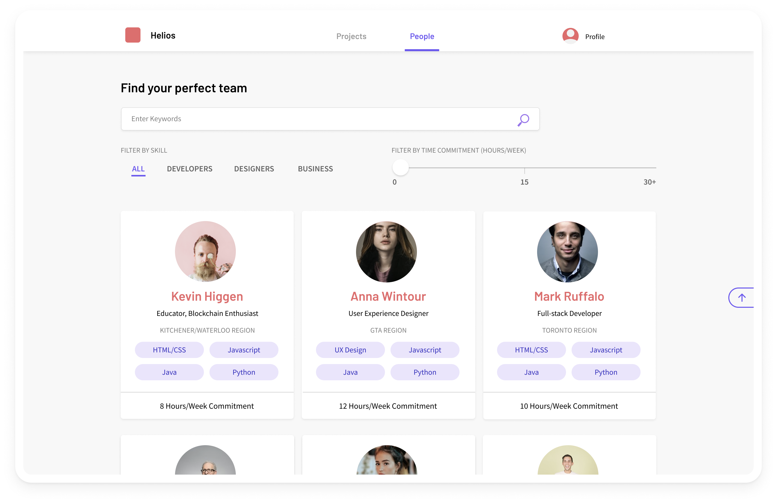
If a user is looking for teammates rather than a project, they can browse a list of individuals who are looking to join a side project, and view their details and main skills.
Decision 1
Prioritizing Time Commitment
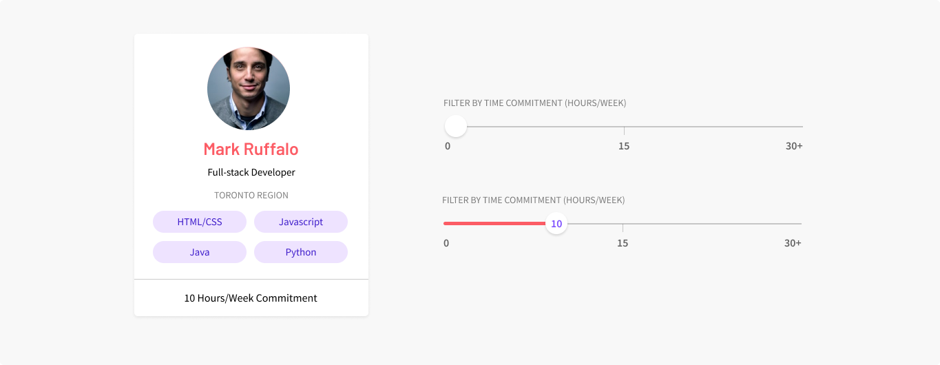
Our research indicated that most of our users consider the amount of time someone can commit to a project as one of the most important factors to know when looking for teammates. From this insight, I made the decision to prioritize the time commitment of every candidate on the card, and include it as one of the main criteria for filtering through the list. The outcome of this would allow users to make faster decisions on who to contact based on their requirements for a teammate.
Past Iterations
Our first iteration of the Helios platform didn't have a people page altogether—we learned after research how valuable it was for users to find the right people with the right skills, and added this page after gathering these insights.
Next Steps
Usability testing, implementing chat function, account creation
Many of the decisions made for this platform have been based on the insights we gathered through our user interviews in the research stage of this project. However, an appropriate next step would be to test our assumptions and validate the user experience choices that we have made. After that, we would need to build out other crucial features for the platform like chat and account creation.
Takeaways
Leadership, working with constraints, and user research
I learned a lot through this project. It was one of my first times leading other designers on a product design team, and I learned how to best communicate with designers and navigate through design ideas and decisions. Working on this platform also taught me a lot about user research, which I haven't done much of before. I got to experience actively applying the things we learned to the choices we made on user experience and interaction patterns. Additionally, we also worked with developers for this project, which gave me the experience of working with real, technical constraints and how to hand off design documentation so that the developers can work smoothly.